
Last week, the New York Times highlighted the Trump 2020 campaign’s use of deceptive web designs to deceive supporters into donating far more money than they had intended. The campaign’s digital donation portal hid an unassuming but unfair method for siphoning funds: a pre-checked box to “make a monthly recurring donation.” This caused weekly withdrawals from supporters’ bank accounts, with some being depleted.
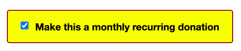
The checkbox in question, from the New York Times April 3rd piece.
A pre-checked box to donate more than you intended is just one example of a “dark pattern”—a term coined by user experience (UX) designer Harry Brignull to define tricks used in websites and apps that make you do things that you didn't mean to, such as buying a service. Unfortunately, dark patterns are widespread. Moreover, the pre-checked box is a particularly common way to subvert our right to consent to serious decisions, or to withhold our consent. This ruse dupes us into “agreeing” to be signed up for a mailing list, having our data shared with third party advertisers, or paying recurring donations. Some examples are below.
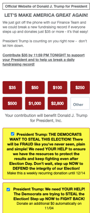
A screenshot of the November 3rd, 2020 donation form from WinRed on donaldjtrump.com, which shows two pre-checked boxes: one for monthly donations, and one for an additional automatic donation of the same amount on an additional date.
The National Republican Congressional Committee, which uses the same WinRed donation flow that the Trump campaign utilizes, displays two instances of the pre-checked boxes.
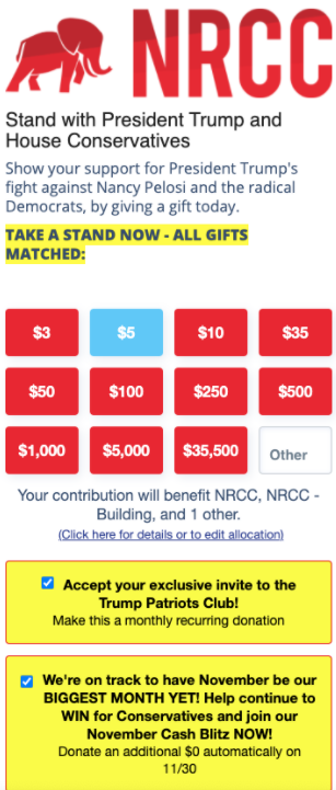
A screenshot of the National Republican Congressional Committee donation site (nrcc.org), from the WayBack Machine’s crawl on November 3rd, 2020.
The Democratic Congressional Campaign Committee’s donation site, using ActBlue software, shows a pre-selected option for monthly donations. The placement is larger and the language is much clearer for what users should expect around monthly contributions. However, this may also require careful observation from users who intend to donate only once.
A screenshot from August 31, 2020 of a pre-selected option for monthly contributions on the Democratic Congressional Campaign Committee (dccc.org).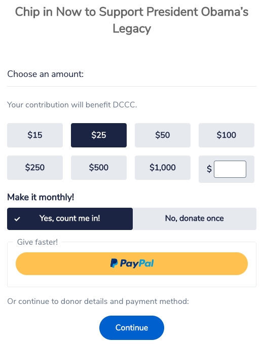
What’s Wrong with a Dark Pattern Using Pre-Selected Recurring Options?
Pre-selected options, such as pre-checked boxes, are common and not limited to the political realm. Organizations understandably seek financial stability by asking their donors for regular, recurring contributions. However, the approach of pre-selecting a recurring contribution can deprive donors of choice and undermine their trust. At best, this stratagem manipulates a user’s emotions by suggesting they are supposed to give more than once. More maliciously, it preys on the likely chance that a user passively skimming doesn’t notice a selected option. Whereas, requiring a user to click an option to consent to contribute on a recurring basis puts the user in an active position of decision-making. Defaults matter: whether making donations monthly is set as “yes, count me in” by default or “no, donate once” by default.
So, does a pre-selected option indicate consent? A variety of laws across the globe have aimed to minimize the use of these pre-selected checkboxes, but at present, most U.S. users are protected by no such law. Unfortunately, some U.S. courts have even ruled that pre-selected boxes (or “opt-out” models) do represent express consent. By contrast, Canadian spam laws require a separate box, not pre-checked, for email opt-ins. Likewise, the European Union’s GDPR has banned the use of pre-selected checkboxes for allowing cookies on web pages. But for now, much of the world’s users are at the whims of deceptive product teams when it comes to the use of pre-selected checkboxes like these.
Are there instances in which it’s okay to use a pre-selected option as a design element? For options that don’t carry much weight beyond what the user expects (that is, consistent with their expectations of the interaction), a pre-selected option may be appropriate. One example might be if a user clicks a link with language like “become a monthly donor,” and ends up on a page with a pre-selected monthly contribution option. It also might be appropriate to use a pre-selected option to send a confirmation email of the donation. This is very different than, for example, adding unexpected items onto a user’s cart before processing a donation that unexpectedly shows up on their credit card bill later.
How Do We Better Protect Users and Financial Contributors?
Dark patterns are ubiquitous in websites and apps, and aren’t limited to financial contributions or email signups. We must build a new landscape for users.
UX designers, web developers, and product teams must ensure genuine user consent when designing interfaces. A few practices for avoiding dark patterns include:
- Present opt-in, rather than opt-out flows for significant decisions, such as whether to share data or to donate on a monthly level (e.g. no pre-selected options for recurring contributions).
- Avoid manipulative language. Options should tell the user what the interaction will do, without editorializing (e.g. avoid “if you UNCHECK this box, we will have to tell __ you are a DEFECTOR”).
- Provide explicit notice for how user data will be used.
- Strive to meet web accessibility practices, such as aiming for plain, readable language (for example, avoiding the use of double-negatives).
- Only use a pre-selected option for a choice that doesn’t obligate users to do more than they are comfortable with. For example, EFF doesn’t assume all of our donors want to become EFF members: users are given the option to uncheck the “Make me a member” box. Offering this choice allows us to add a donor to our ranks as a member, but doesn’t obligate them to anything.
We also need policy reform. As we’ve written, we support user-empowering laws to protect against deceptive practices by companies. For example, EFF supported regulations to protect users against dark patterns, issued under the California Consumer Privacy Act.