
When we talk about patents, we’re usually talking about “utility” patents. Utility patents protect inventions that claim to have some practical application or use. (A lot of them still claim things that are actually useless, but they’re supposed to be potentially useful.)
“Design” patents, by contrast, protect only the ornamental or decorative aspects of a design. They don’t protect any kind of functionality. If there’s a functional work to protect, only a utility patent will do.
Because design patents can only protect non-functional works, they’re kind of like copyrights for visual works. And the bar for creativity and originality in a patented design is low—so low that even a standard-issue graphical user interface can get patent protection, as our latest Stupid Patent of the Month shows.
Shown below is a patented design owned by Siemens Healthcare GmbH, a company that’s part of Siemens, the most prolific patent-filer in Europe:
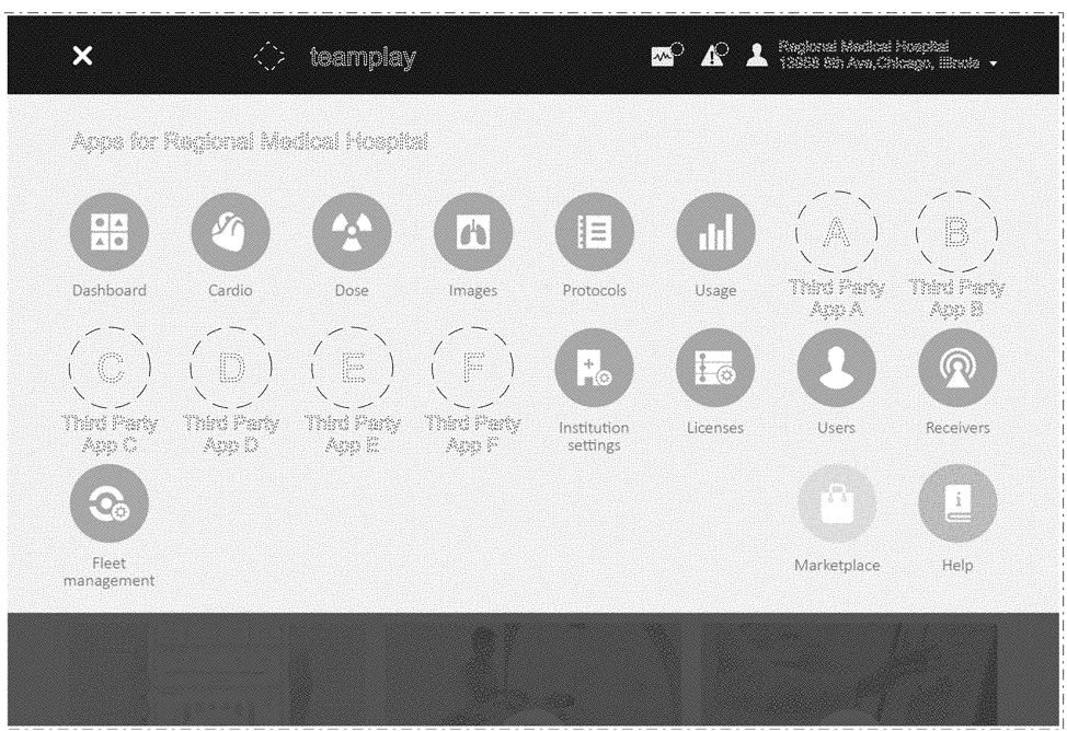
This patent, U.S. Patent No. D872,112, is a relatively standard GUI, with rows of circular icons displayed beneath a header bar. But the patent doesn’t protect everything in that picture—importantly, the portions circled by broken lines are not part of the patented design. The design also includes features that are not in the picture—namely, the colors used in the display. To understand what’s actually been patented here, a member of the public must do more: they can request and pay for a hard copy of the patent from the U.S. Patent Office or navigate through the PTO’s (extremely clunky) PAIR database in the hopes of finding a downloadable version of the originally-filed image.
Between the image’s poor quality and the broken lines denoting unprotected features, it’s practically to impossible to identify what the patented design even is. Is it the specific arrangement of circular icons in the three rows? If so, then why are certain circular icons excluded? Is it the icons that a Siemens designer created to represent things like “users” and “receivers?” If it’s this hard to say what the patented design actually is, it will be even harder to determine whether other designs are infringing. Infringement turns on the comparison between the patented design, the accused design, and the prior art. But that analysis can’t even happen until it is clear exactly what a design patent protects.
The low examination standards, lack of clarity, and resulting low quality of design patents already pose a big problem. But it could be about to get worse. Pro-patent lobbyists are pushing to give design patent owners more power over tech developers and users. They’ve introduced a bill that gives Customs and Border Protection the power to seize products at the border just by sizing them up and comparing them to design patents, whose owners are demanding this new type of special treatment.
Giving CBP so much power will pose a real danger to ordinary technology users. Imagine CBP trying to determine infringement for a patented design like the one above, which is a GUI for medical software. To assess infringement, CBP officers could examine a device, including software applications, to see if they match patented designs in the registry. When those applications pertain to health services, the medical privacy of users may be at risk.
Design patents owners don’t need more power than they have today. Instead, we should be asking whether design patents should exist at all. We already have copyright. It’s not clear that granting extra patent rights to works with no practical application provides any benefit to the public at all.